King’s Cross Square landscape architecture London

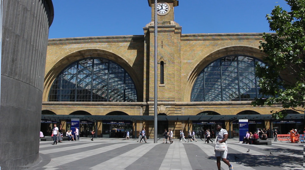
The space in front of King’s Cross was redesigned by Stanton Williams in 2010. Previously, it was occupied by a scrappy ticket hall which partly obscured Cubitt’s handsome 1852 station facade. Clearing the space was a wise choice.
The open space was re-designed to create several distinct spatial zones: a transit zone used by pedestrians heading for the station, seating in the sun and seating in the shade of trees, for people awaiting a departure or an arrival. The outdoor concourse uses bands of dark and light granite to create a visually link with the design of the station facade.
Was re-design a success? Only to the extent that it is an improvement on what was there before and the view of the station has been improved. It’s perfectly OK for walking across but it lacks most of the qualities which make a good urban square and has some big negatives. The space is cruelly exposed to noise from the Euston Road. The seating is physically and socially uncomfortable. The square fails on ecological and sustainability criteria. Basically, it is an exterior facade which happens to be horizontal. Dull.
Stanton Williams boast an enthusiasm for context-sensitive design but to my eye the landscape architecture bristles with doctrinaire abstract modernism, which is the least context-sensitive approach of modern times.
