The Royal Docks Development is a good example of bad architecture and helpless planning

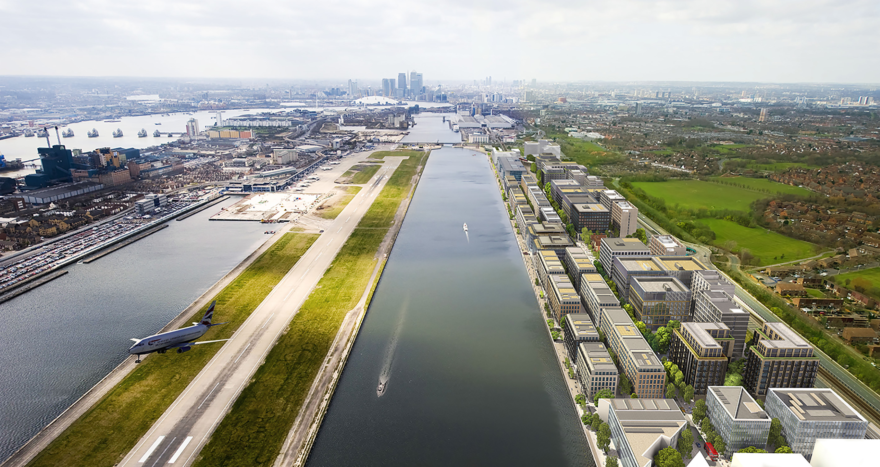
The file-name of this depressing image is Riverside-day-overall-view-23032017-Final.jpg. The word ‘Final’ is ominous and, as anyone can see, the blocks are beside a disused dock and a busy runway: it is not a ‘riverside’ development.
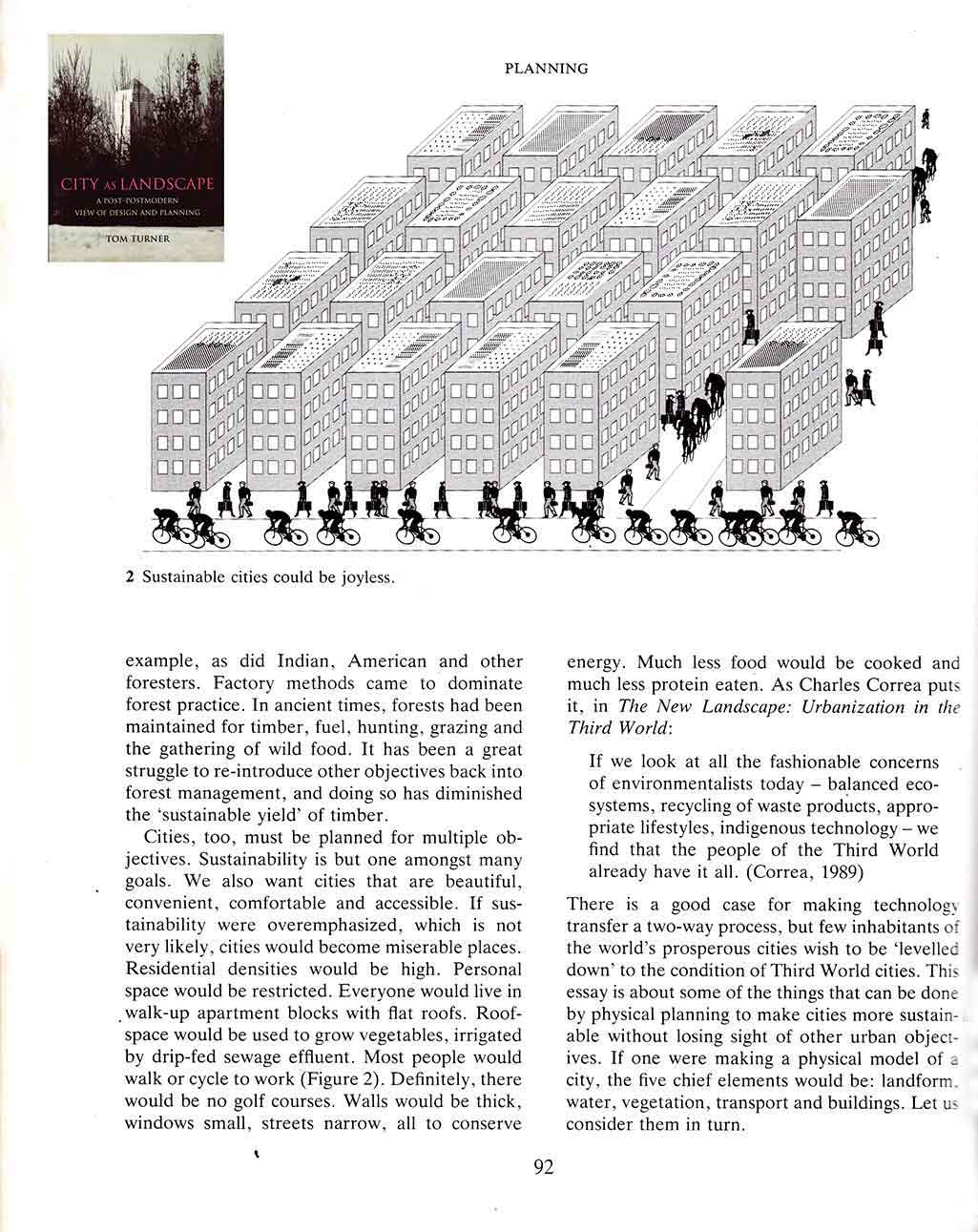
Suing the development team for copyright infringement (they must have been ‘inspired’ by the below image from p.92 of City as Landscape) would be a satisfying but I would not want to take the money. And if the team had red the text as well as treating the image as eye candy they would have understood that the drawing was intended to show that cities could easily become ‘miserable places’.

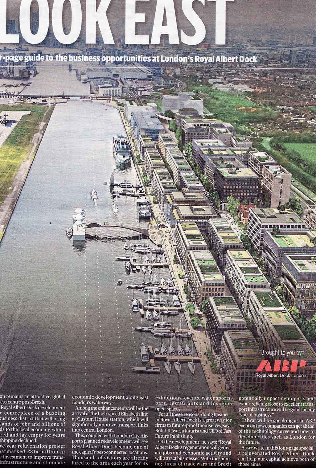
Apart from its unimaginative blocky ugliness the worst things about the scheme are the unappealing ‘greenspace’ and wicked waste of roofspace. The below illustration (Evening Standard 4.9.2018) shows some sedum roofs and some vacant roof garden type space. But the design goes no way towards the green roof city London should become. I’m disappointed. The developers (China-based ABP) could make more profit with a better design. At the outset, they should have commissioned a plan from a firm of landscape architects. Architecture and planning firms are out of their professional depth on what should be landscape urbanism projects.

