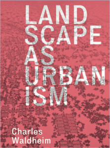
Charles Waldheim Landscape as Urbanism: A General Theory, review by Tom Turner

This is an important book.
Teachers should read it to place their pedagogy on a theoretical basis. Practitioners should read it to improve their design projects.
Even now, too many landscape architects base their work on outdated Modernist principles. A sizable group, convinced their methodology is sound, are unaware of its Modernist character. Their design method is ‘outdated’ not because it is wrong but because it is inadequate; it does not go far enough.
Mies van der Rohe, for High Modernism, declared that ‘Less is more’. Robert Venturi, for Early Postmodernism, responded that ‘Less is Bore’. Both were architects and both spoke truths. Landscape architects largely ignored the debate, which was a great mistake. Charles Waldheim has entered the debate and, in my view, made a contribution which the architects, planners and urban designers should take on board. The video, below is a London example. The approach Waldheim advocates is explained as a fusion of Ian McHarg’s ecological method, which was modernist, with the ‘design culture’ launched by Bernard Tschumi and Rem Koolhaas, which is postmodern. When their winning entries for the 1982 Parc de La Villette competition were announced, most landscape architects, including me, failed to understand their importance. For many landscape architects, this remains the case.
Landscape urbanism rests on two pillars:
- Ian McHarg’s layered approach to ecological design
- The Parc de la Villette layered approach to de-authored design (de-authored because the physical form resulted from the interaction of autonomous layers)
McHarg’s approach was inspiring but suffered from a lack of design culture. The layering proposed by Koolhaas and Tschumi was inspiring but suffered from ecological ignorance. Bringing the ecological and cultural layering together can re-invigorate landscape architecture. Waldheim also argues, bravely and convincingly, that the ideas associated with landscape urbanism have the potential to lead the practice of architecture, planning and urban design – out of the concrete jungle. I joined the landscape profession thinking of it as having a focus on projects of intermediate scale between architecture and planning. This was not entirely wrong. But it missed the important point that the profession has important intellectual affinities with its sibling professions. In this respect, it is both ‘architecture writ large’ and ‘planning writ small’.
Another concern of Waldheim’s is with the origin and definition of the term ‘landscape architecture’. He sets out the evidence for the two alternatives origins. Olmsted’s adoption of the term could have come:
- via Alphand, from La Théorie des Jardins (Paris 1776) by Jean-Marie Morel (1728 – 1810)
- via Loudon and Downing, from Gilbert Laing Meason’s 1828 book on The landscape architecture of the great paintings of Italy.
Waldheim supports the first theory and I, for reasons will be explained in a future blog post, favour the second explanation. The issue has more theoretical importance than one might think and I was pleased to find it aired in this book.
I was also pleased to find Waldheim pushing the history of the landscape architecture profession back from the mid-nineteenth century to the mid- sixteenth century. This may break some of the intellectual log-jams which have hitherto constrained the growth of landscape architecture. The standard histories of the profession, by NT Newton, GA Jellicoe and others situate the profession’s design origins in the ancient world. Far too little work has been done on its theoretical origins. Waldheim takes us back 300 years. I look forward to it being taken further back, to include the early days of settlement and civilization. Another 10,000 years would be a good start.
I spent 3 hours in a cold car, waiting for a friend, reading Waldheim’s book, looking at this ‘new square’ outside the Waldron Health Centre, and thinking ‘it’s a complete “waste of space” – what it needed was a landscape urbanism design approach’. The architects, Henley Halebrown Rorrison HHbR, wrote that ‘The square and west façade are framed by a canopy, concrete arcade and screen, all of which invite proximity and provide a counterpoint in scale and material to the greater building mass. Resting on the canopy are storey high super graphics WALDRON, HEALTH and CENTRE. Seen together they constitute a useful sign, but, seen apart, as they often are, they play a part in the composition of each elevation and in the sculptural and material character of the whole. There are two key ideas at play in the design of The Waldron: the reciprocity between the social logic of the interiors and its capacity outwardly to shape or frame the allotments, square and adjacent streets; and, the dialectic between the homogenous largely timber elevations, in which the fenestration is evident and from certain viewpoints concealed by the fins; and the superimposition of the heterogeneous, both literal and abstract, counterpoint of the super graphic letters.’ Waldheim is right that architects, town planners and urban designers have much to learn from landscape urbanists. See also: Creekside Village and King’s Cross Plaza for further examples of Kookhaas-inspired striped-geometry.
